如何使用 Chart.js 在 JavaScript 中制作圖表?
本文是關于使用 chart.js 在 JavaScript 中制作圖表的詳細教程。
有許多JavaScript 庫可用于繪制不同的圖表,包括折線圖、條形圖、圖形等等。
如果您正在嘗試學習如何使用 JavaScript 在您的網站上動態顯示數據,Chart.js是您可以測試的庫之一。
React是最好的 JavaScript 框架之一,還提供了一組很酷的圖表庫,您可以通過這些庫創建 Web 和混合應用程序的酷界面。
開始使用 Chart.js 開發數據可視化的步驟是什么?
在本文中了解如何操作。
什么是 Chart.js?
Chart.js 是一個開源的數據可視化 JavaScript 庫,可以繪制基于 HTML 的圖表。
它目前能夠支持八種可以動畫的交互式圖表。要使用 chart.js 創建基于 HTML 的圖表,您需要一個HTML 畫布來顯示它。
該庫可用于一系列數據集和其他自定義參數,如邊框顏色、背景顏色等。
其中之一的數據集稱為標簽數據集,即 X 軸的值。另一個是數字的集合,通常沿著 Y 軸。
還需要在圖表對象內部定義圖形類型,以確保庫可以確定要繪制什么圖形。
使用 Chart.js 在 JavaScript 中創建圖表
正如我們之前提到的,您可以使用 chart.js 制作各種圖表。
在本教程中,我們將從條形圖和折線圖開始。一旦您了解了這些圖表類型的概念,您將擁有繪制其他可用圖表所需的信息和工具。
首先使用 chart.js,創建所需的文件。在本指南中,文件的名稱將是 chart.html、plot.js 和 index.css。您可以使用任何命名約定來命名您的文件。
然后,將以下代碼復制并粘貼到 HTML 文檔的標題區域。這將創建提供指向 Chart.js 內容交付網絡 ( CDN ) 的鏈接。
在 chart.html 上:
<head> <script src="https://cdnjs.cloudflare.com/ajax/libs/Chart.js/2.8.0/Chart.min.js"> </script> </head>
HTML文件的格式如下:
<!DOCTYPE HTML><html> <head> <title> Chart </title> <link rel="stylesheet" href="index.css"> <script src="https://cdnjs.cloudflare.com/ajax/libs/Chart.js/2.8.0/Chart.min.js"></script> </head> <body> <header> <h1> Charts </h1> </header> <canvas id="plots" style="width:100%;max-width:700px"></canvas><script src="plot.js"></script></body></htm/>
在你的 CSS 中:
body{ background-color:#383735;}h1{ color:#e9f0e9; margin-left:43%;}#plots{ margin:auto; background-color: #2e2d2d;}
上面顯示的CSS樣式不是標準的。你可以根據你的喜好,根據你的 DOM 的結構來設置它的樣式。當您完成 HTML 或 CSS 文件并準備好使用 JavaScript 創建圖表時。
折線圖
對于要使用 chart.js 創建的折線圖,您需要將圖表類型更改為折線。這告訴庫如何繪制折線圖。
為了顯示這一點,在 JavaScript 文件中:
// Get the HTML canvas by its id plots = document.getElementById("plots");<strong>// Example datasets for X and Y-axesstrong> var months = ["Jan", "Feb", "Mar", "Apr", "May", "Jun", "Jul"]; <strong>//Stays on the X-axisstrong> var traffic = [65, 59, 80, 81, 56, 55, 60] //Stays on the Y-axis // Create an instance of Chart object:new Chart(plots, { type: 'line', <strong>//Declare the chart typestrong> data: { labels: months, <strong>//X-axis datastrong> datasets: [{ data: traffic, <strong>//Y-axis datastrong> backgroundColor: '#5e440f', borderColor: 'white', fill: false, //Fills the curve under the line with the background color. It's true by default }] },});輸出:
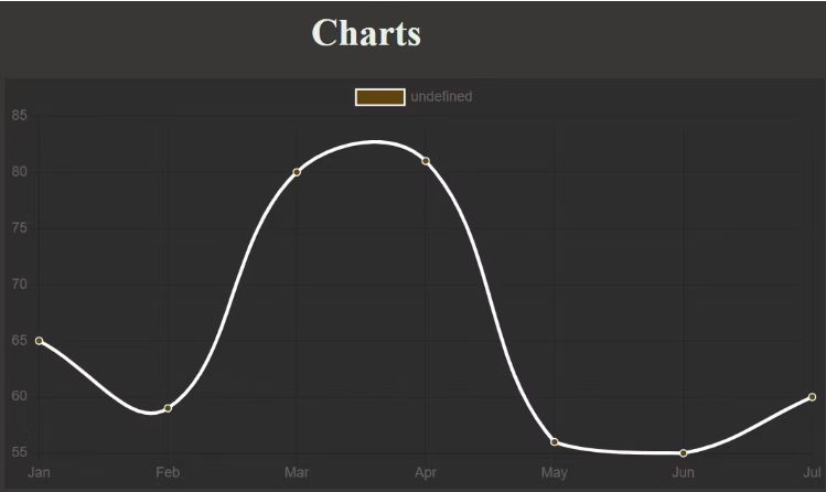
隨意將您的填充值更改為真實,使用其他數據或修改顏色以觀察發生的情況。
如您所見,頂部附近有一個額外的圖例框。您可以將其從選項參數中取出。
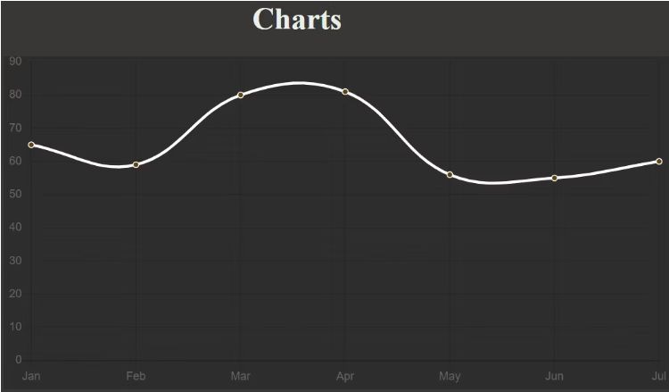
除了刪除或添加圖例之外,它的選項參數還可用于進行其他調整。例如,您可以應用它來使軸從零開始。
定義選項參數。這是 JavaScript 文件中圖表部分的外觀:
// Create an instance of Chart object:new Chart(plots, { type: 'line', <strong>//Declare the chart typestrong> data: { labels: months, <strong>//X-axis datastrong> datasets: [{ data: traffic, <strong>//Y-axis datastrong> backgroundColor: '#5e440f', <strong>//Color of the dotsstrong> borderColor: 'white', <strong>//Line colorstrong> fill: false, //Fills the curve under the line with the background color. It's true by default }] },<strong> //Specify custom options:strong> options:{ legend: {display: false}, //Remove the legend box by setting it to false. It's true by default. //Specify settings for the scales. To make the Y-axis start from zero, for instance: scales:{ yAxes: [{ticks: {min: 0}}] //You can repeat the same for X-axis if it contains integers. } } });輸出:
您還可以為每個點的背景選擇不同的顏色。然而,這種方式的背景顏色變化通常更適合條形圖。
使用 ChartJS 創建條形圖
這是唯一一次您必須將圖表類型更改為條形。無需更改顏色選項的選項,因為條形將自動繼承其背景顏色:
// Create an instance of Chart object:new Chart(plots, { type: 'bar', <strong>//Declare the chart typestrong> data: { labels: months, <strong>//X-axis datastrong> datasets: [{ data: traffic, <strong>//Y-axis datastrong> backgroundColor: '#3bf70c', <strong>//Color of the barsstrong> }] }, options:{ legend: {display: false}, //Remove the legend box by setting it to false. It's true by default. }});輸出:
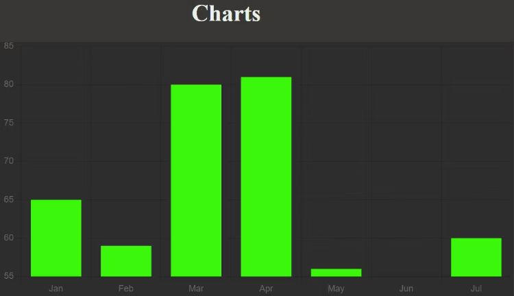
隨意將 Y 軸設置為從零或任何其他值開始,就像您對折線圖所做的那樣。
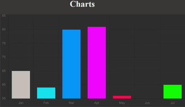
要為每個條使用不同的顏色,您必須將與數據中的項目數量兼容的顏色數組傳遞給 backgroundColor 參數:
// Create an instance of Chart object:new Chart(plots, { type: 'bar', <strong>//Declare the chart typestrong> data: { labels: months, <strong>//X-axis datastrong> datasets: [{ data: traffic, <strong>//Y-axis datastrong> <strong>//Color of each barstrong>: backgroundColor: [ "rgba(196, 190, 183)", "rgba(21, 227, 235)", "rgba(7, 150, 245)", "rgba(240, 5, 252)", "rgba(252, 5, 79)", "rgb(0,12,255)", "rgb(17, 252, 5)"], }] }, options:{ legend: {display: false}, //Remove the legend box by setting it to false. It's true by default. }});輸出:
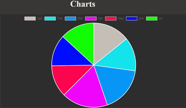
使用 Chart.js 創建餅圖
要創建餅圖,請將圖表類型切換為餅圖。也可以使圖例的顯示為真以確定餅圖的每個部分是什么:
// Create an instance of Chart object:new Chart(plots, { type: 'pie', //Declare the chart type data: { labels: months, //Defines each segment datasets: [{ data: traffic, //Determines segment size //Color of each segment backgroundColor: [ "rgba(196, 190, 183)", "rgba(21, 227, 235)", "rgba(7, 150, 245)", "rgba(240, 5, 252)", "rgba(252, 5, 79)", "rgb(0,12,255)", "rgb(17, 252, 5)"], }] }, options:{ legend: {display: true}, //This is true by default. } });輸出:
就像您在前面的示例中所做的那樣,通過更改圖表類型來嘗試不同的圖表。
但是,支持一些 chart.js 圖表類型。chart.js 圖表類型,您可以使用上面的代碼約定:
- 酒吧
- 雷達
- 線
- 甜甜圈
- 餡餅
- 氣泡
- 分散
- 極區
向前進
盡管您在本教程中只熟悉了餅圖、折線圖和條形圖,但使用 chart.js 繪制其他圖表的 Code Pattern 也基于相同的原理。您也可以自由地嘗試其他圖表。